Vine Brothers
Wine Experience for Young Adults
Role:
UX, Packaging, Branding Design
Team. Hyojin Kim | Advisor. Prof. Minsung Kwon | 2015
Your first wine is here
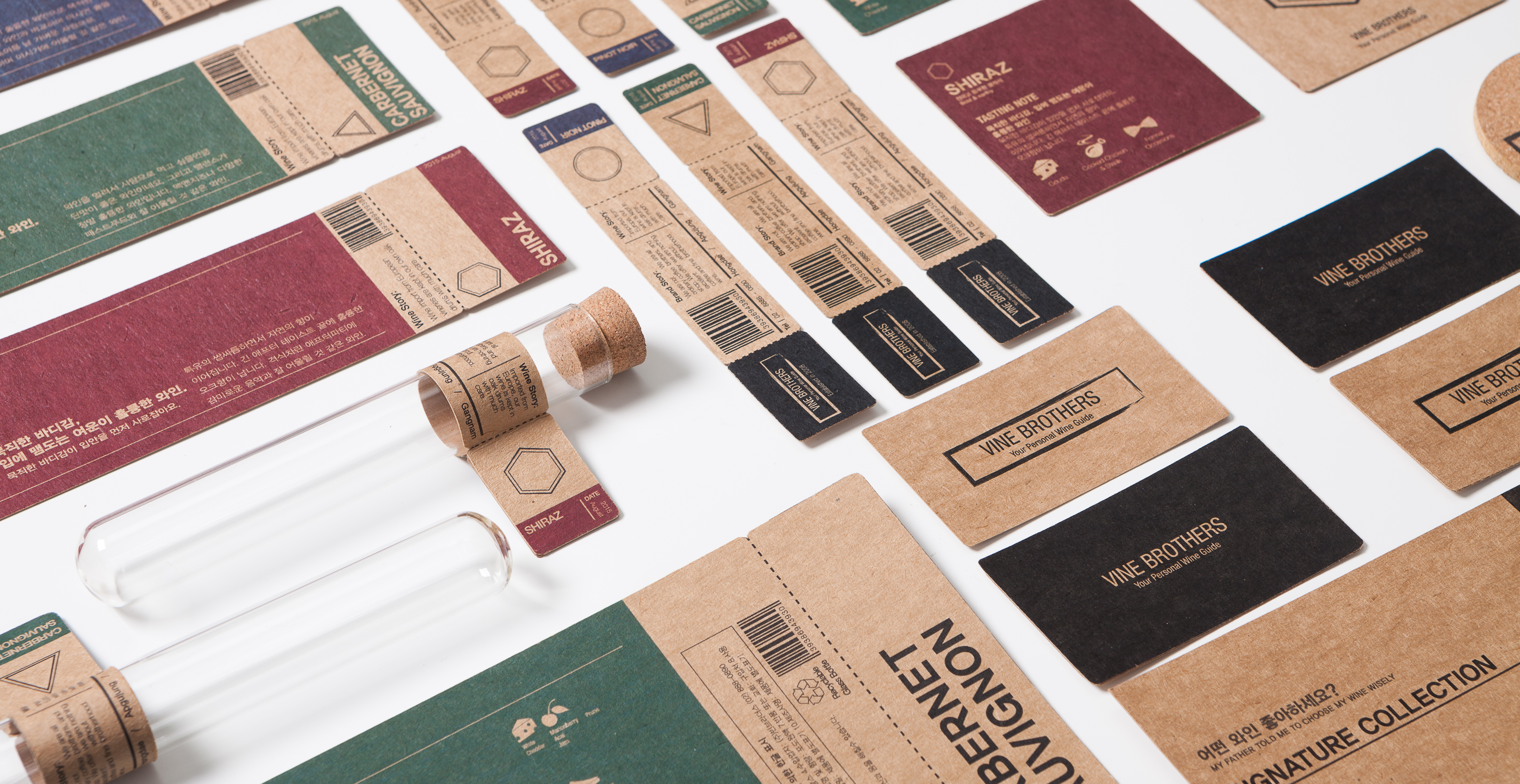
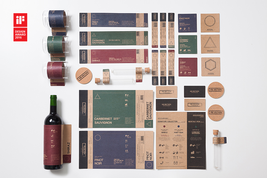
Wines can be esoteric at first. Vine Brothers is a wine bar, aiming to provide a better wine experience especially for young adults that are new to wine. With a new form of wine tasting experience and simplified graphic tasting notes, customers can easily choose a wine that matches their preferences.
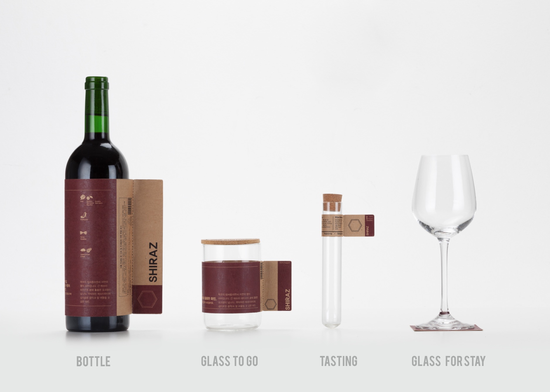
Now with ‘take-out glass', people can enjoy their favorite wine at anytime, anywhere.
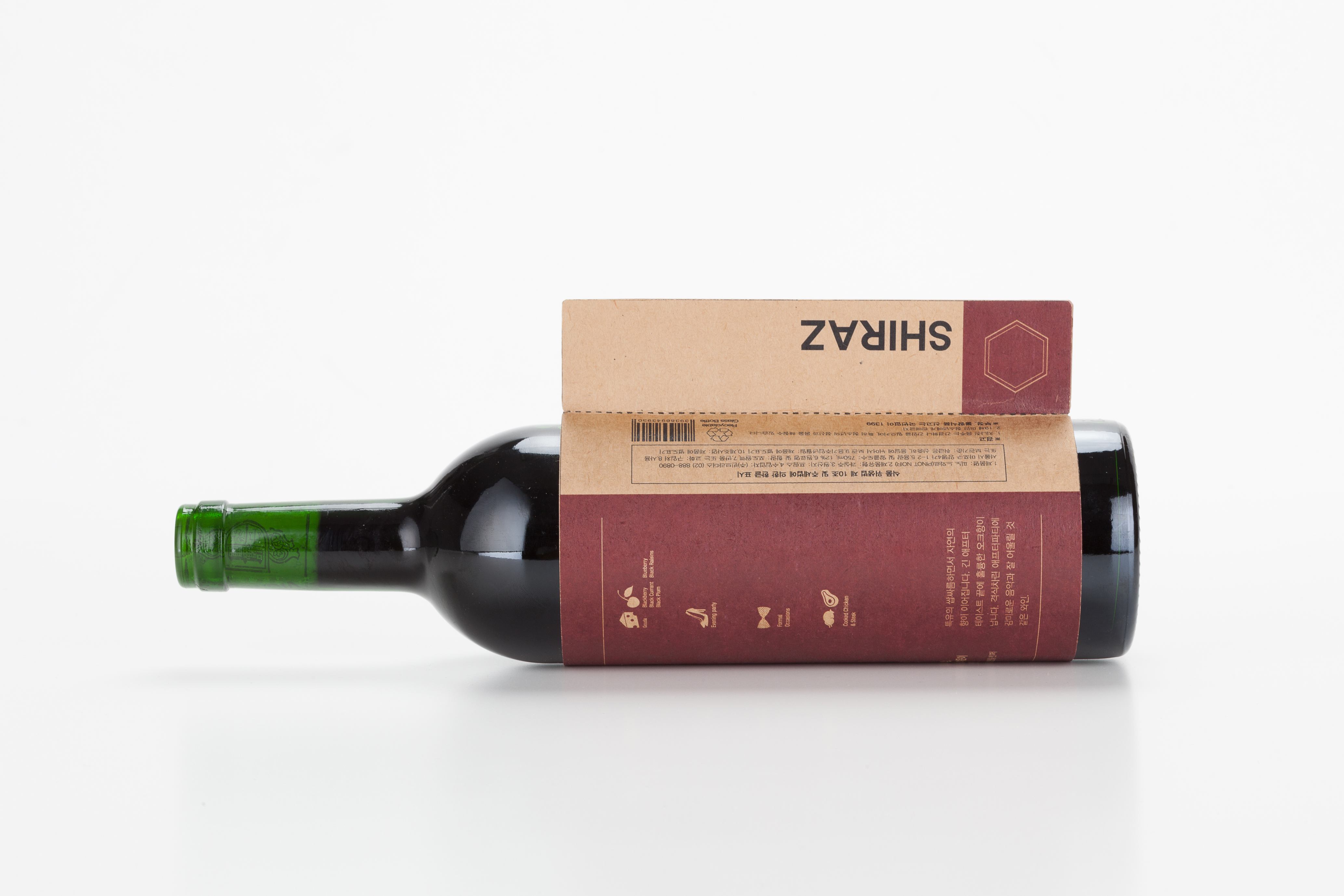
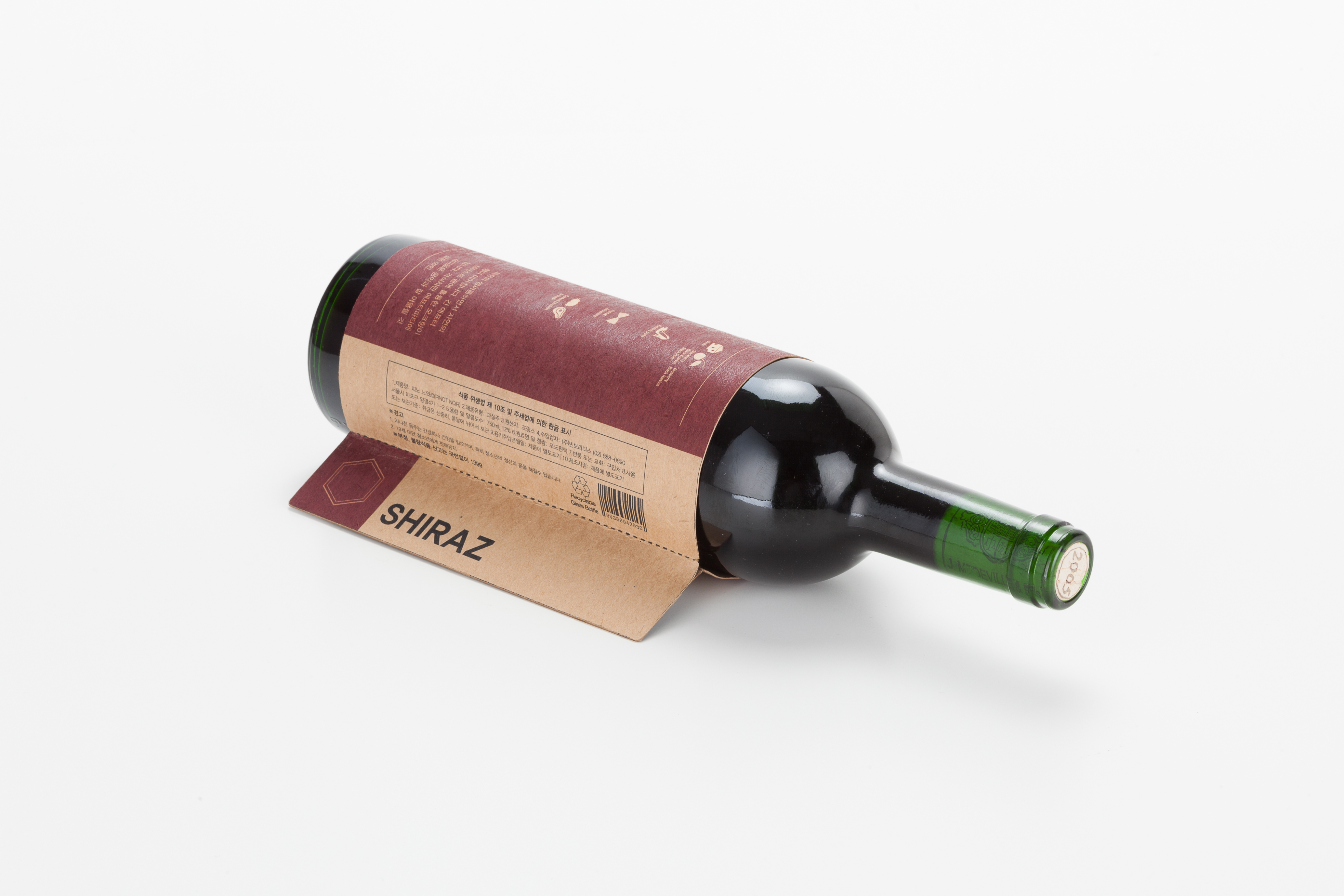
The slit packaging design safely holds the take out items in place while allowing users to see the label.
By glass, take out
For people who wants just one glass of wine to enjoy it somewhere else.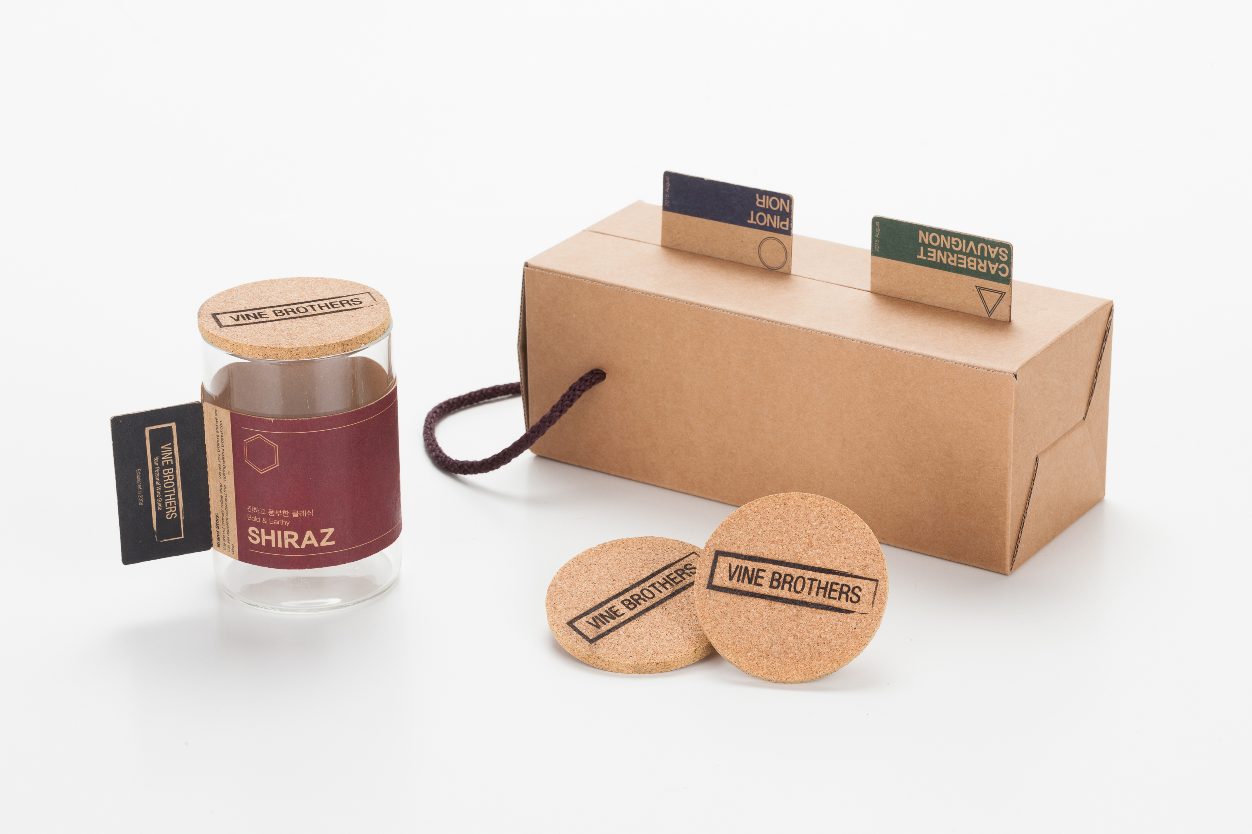
By bottle, take out
The label can be used to lay the bottle still.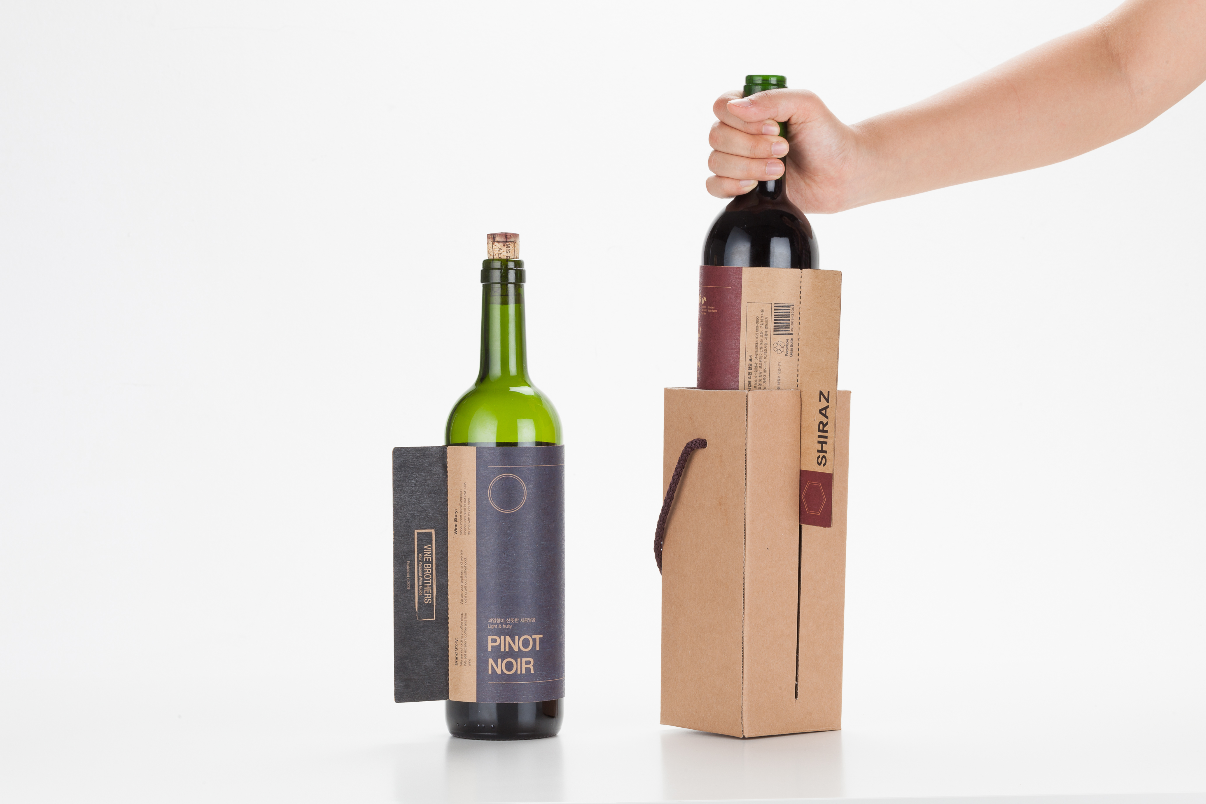
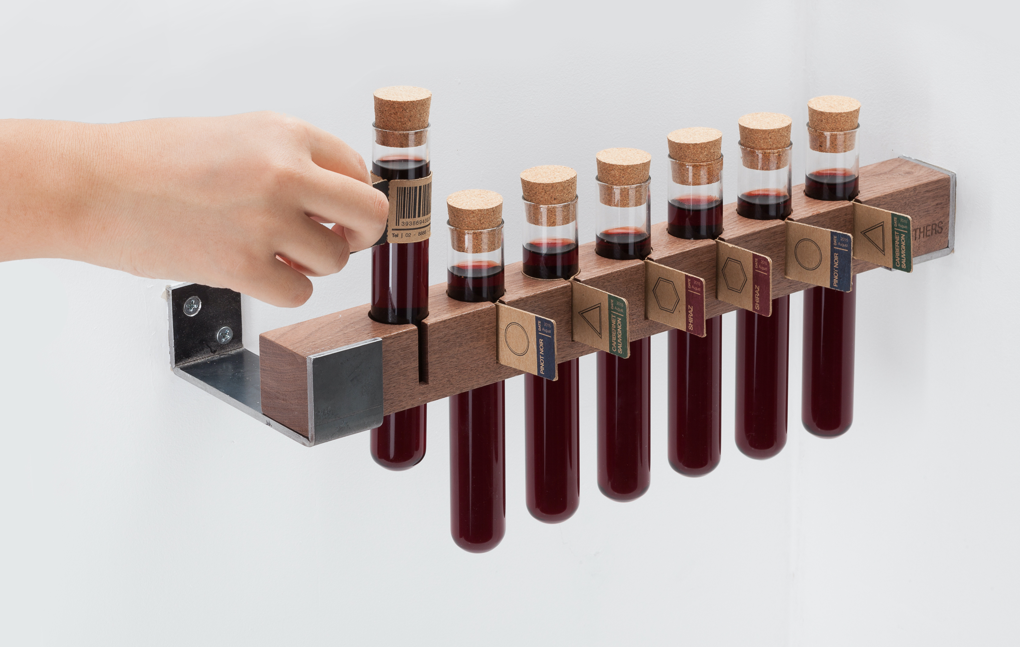
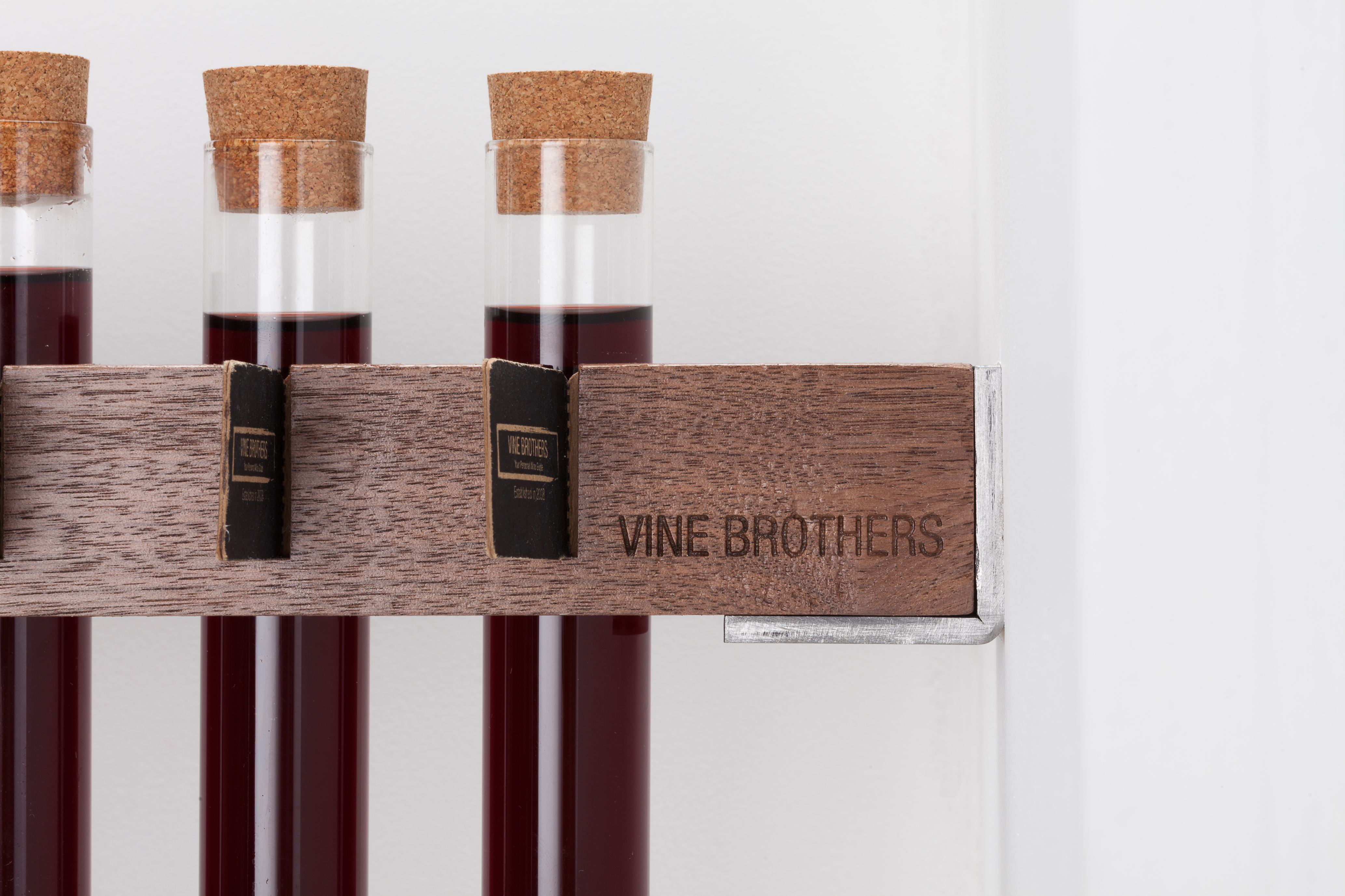
Tasting Tube
You never know if you love or hate the wine before opening the whole bottle. People can come and purchase small amount of wine to taste before choosing the right wine. The wooden rack holds the tasting tubes in place with the labels showing.
Glass of Wine
Enjoy wine at the bar with the witty coaster that shows information about your wine.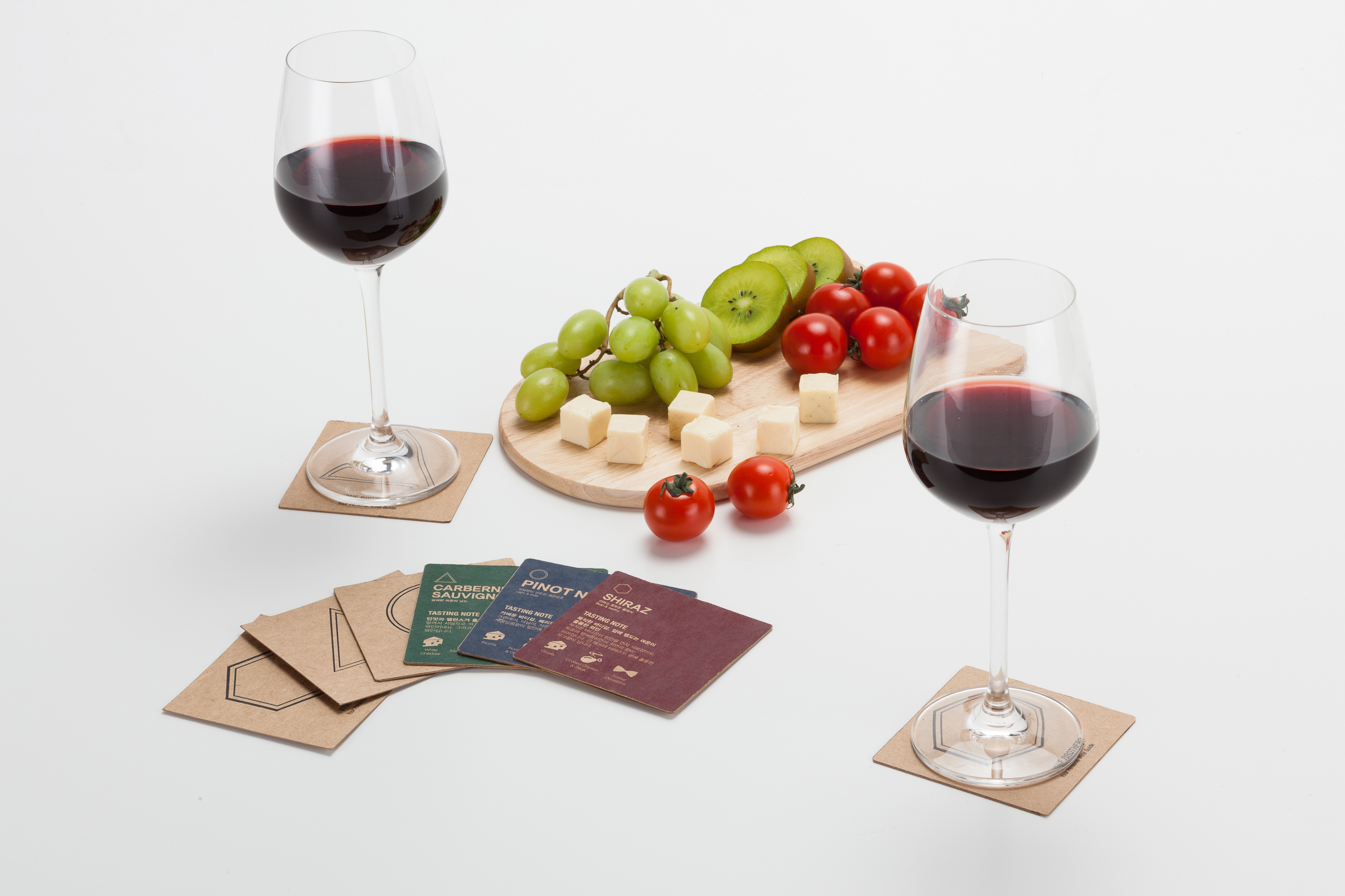

Design Concept
Vine Brothers is based on a modification of an actual cafe that 20's enjoy (Bean Brothers). Brand strategy redesigned as a wine serving scenario, a professional sommelier at Vine Brothers will recommend and sell wine in bottles, glasses, and flasks.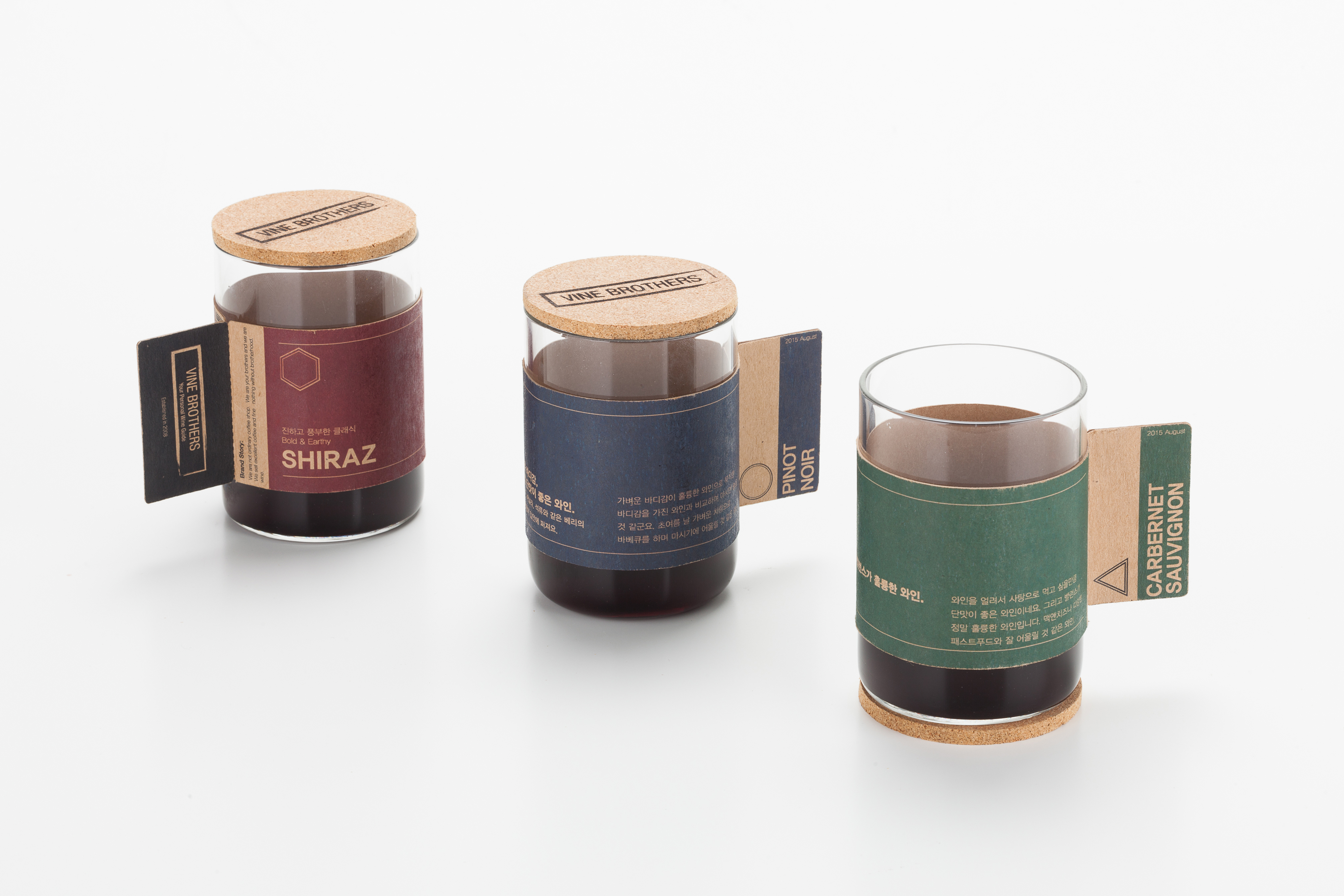
Polygon Symbol
Each wine is labeled a shape of polygon. These shapes represent the fullness of wine, depending on how many edges it has. (Triangle has a light body, Hexagon has comparatively fuller body)
Elements & Design Language
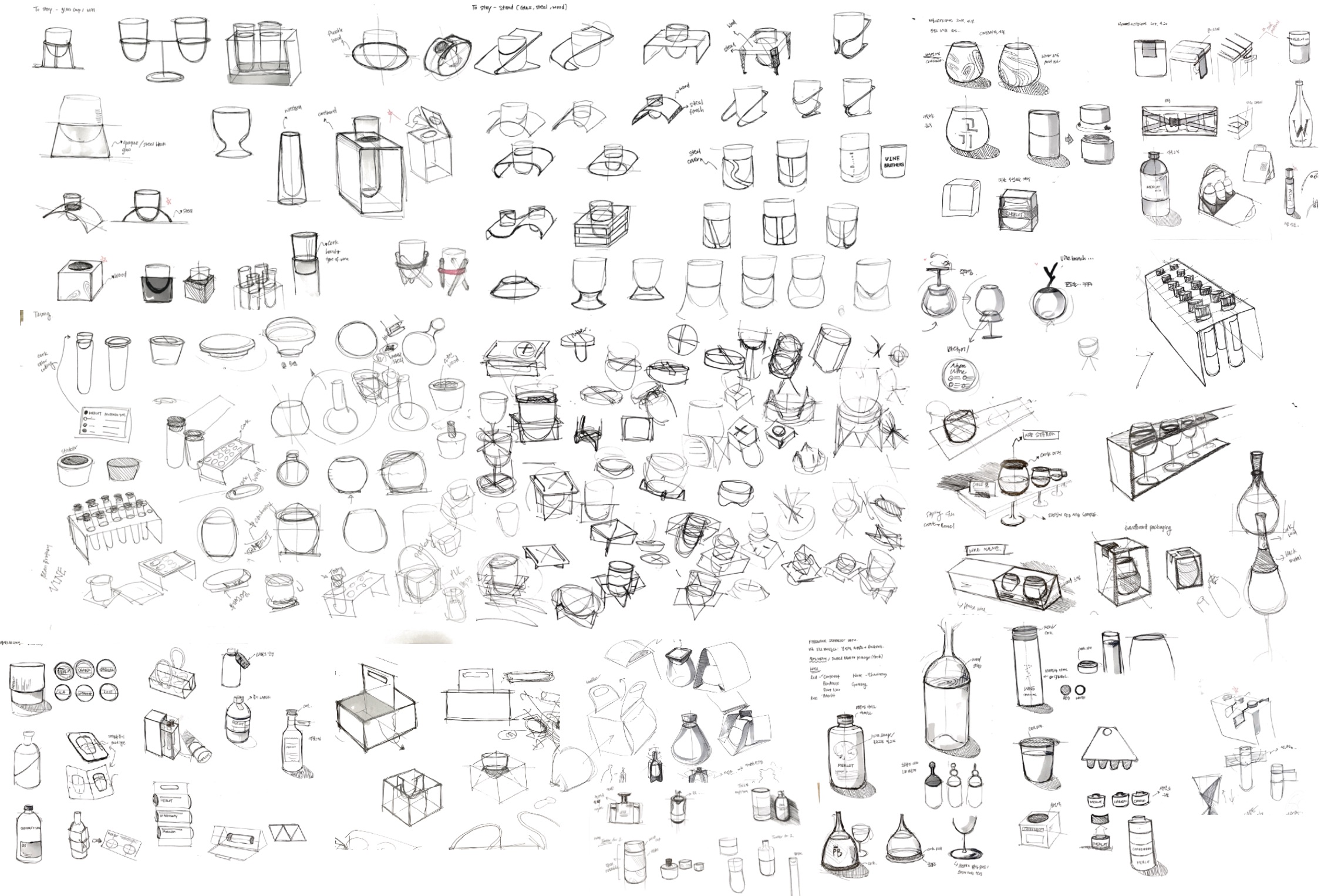
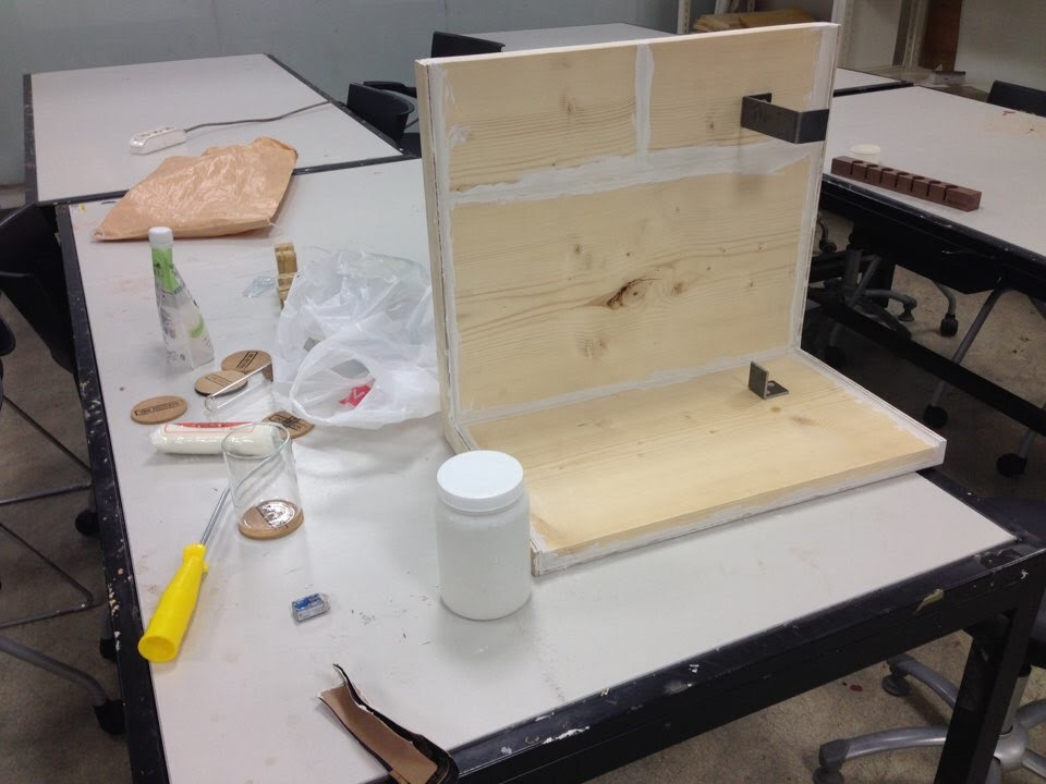
Ideation & Woodworking