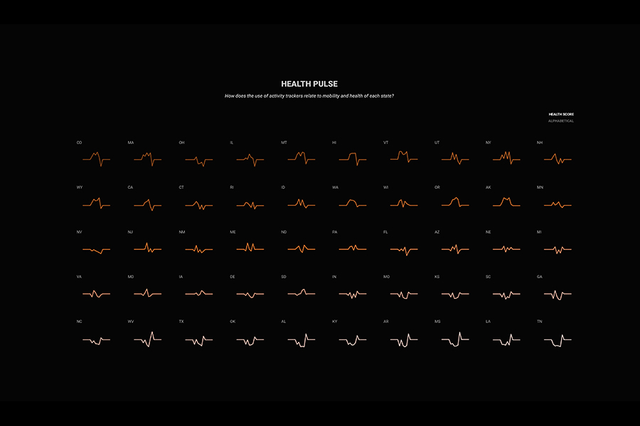
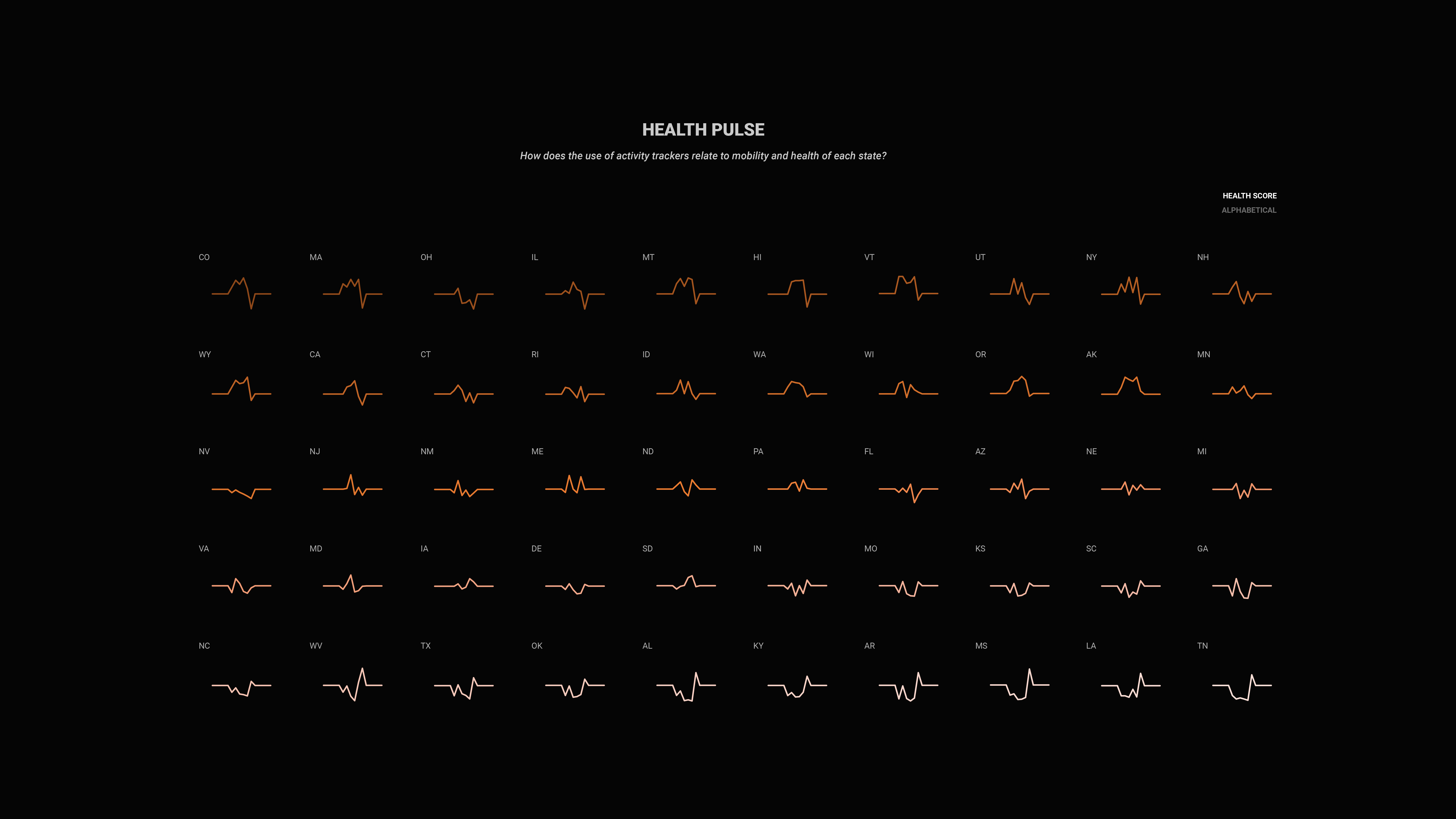

Health Pulse
Data Visualization/GUI/HCI
Harvard University | 2018
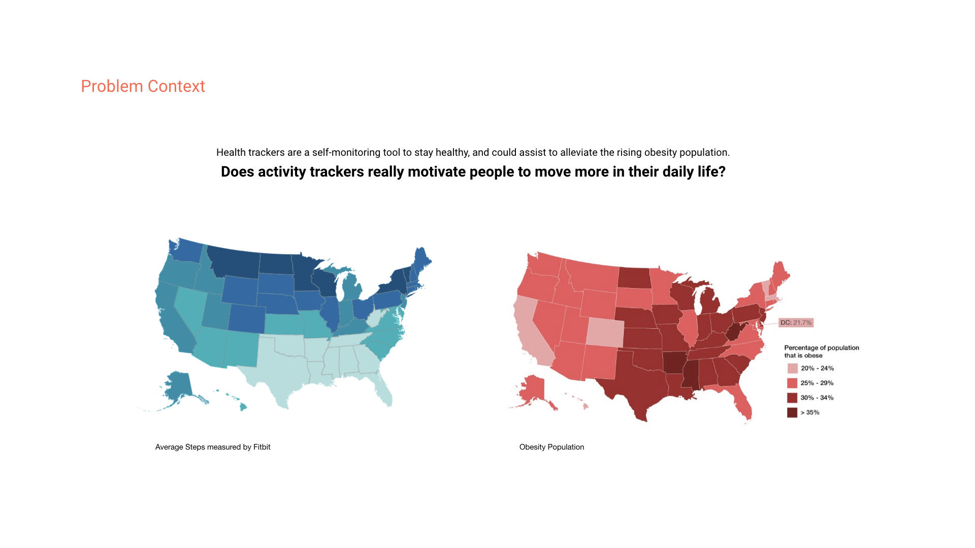
"Do activity trackers actually motivate people to move more in their daily life?"
Health Pulse is a data visualization and interaction concept to show the relationship between health, mobility and activity level in each state.
Inspiration
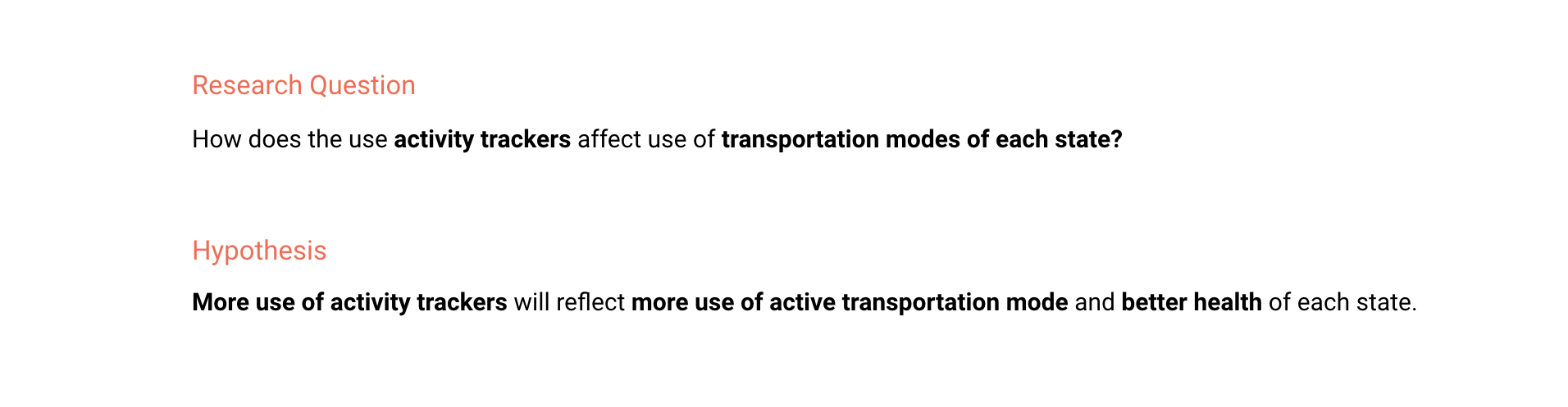
The activity trackers promise the users to become healthier by self monitoring their own movement. Whether activity trackers actually motivate users to be more active in their daily life needs to be examined at a broader level. The objective of this study was to evaluate each state’s relationship among activity tracker usage, activity levels and transportation modes.
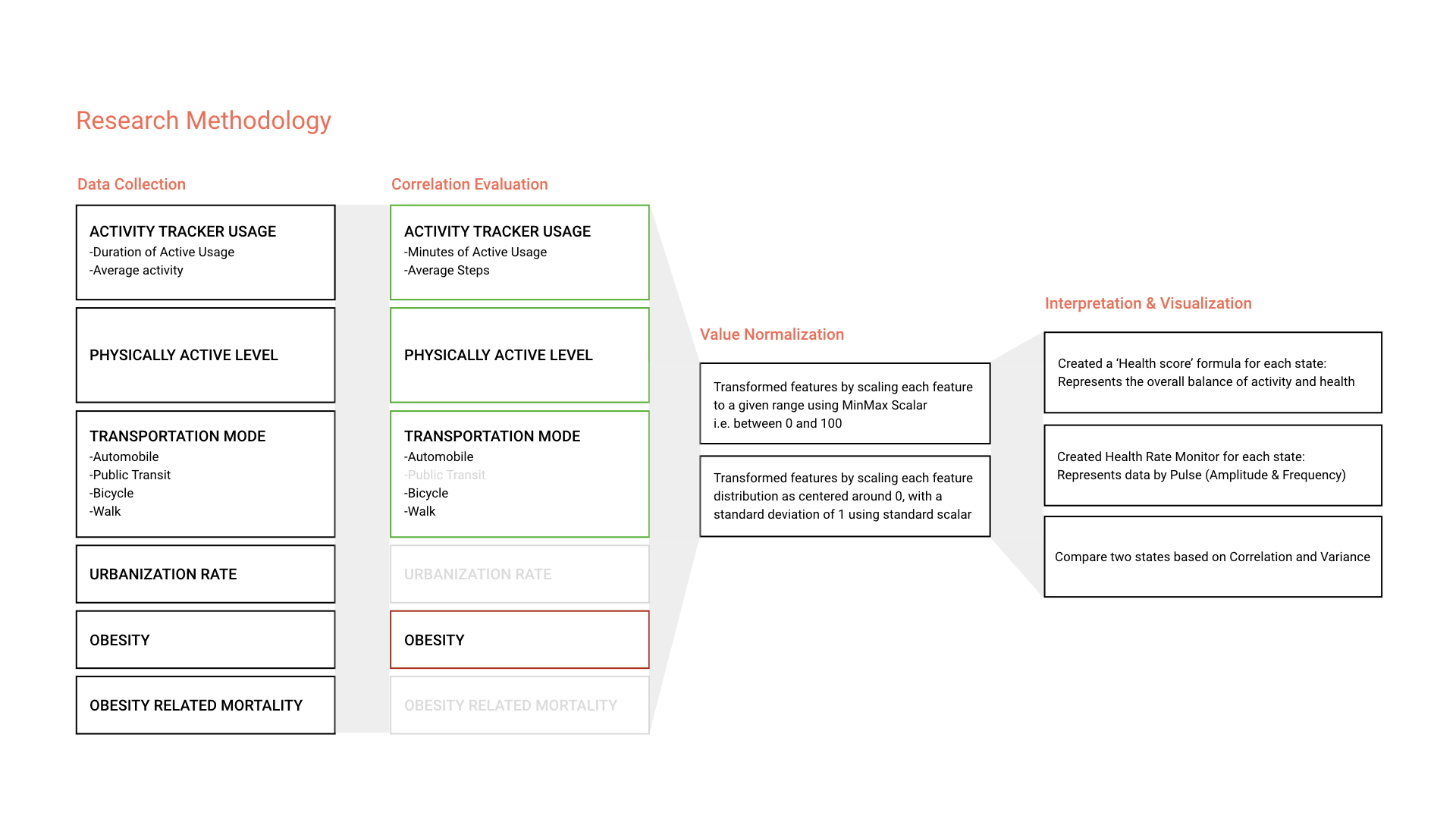
Data Analysis
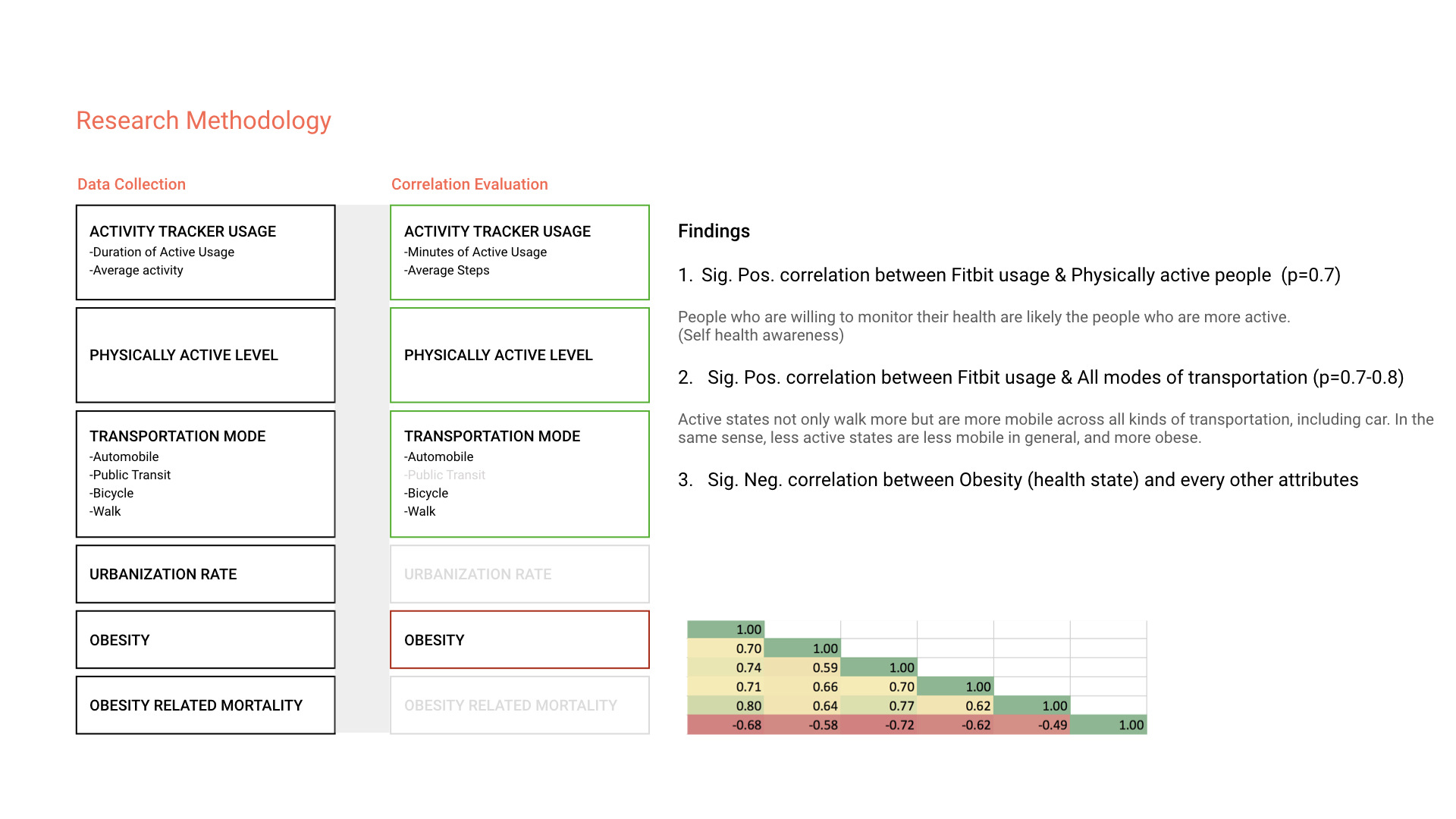
Data Collection
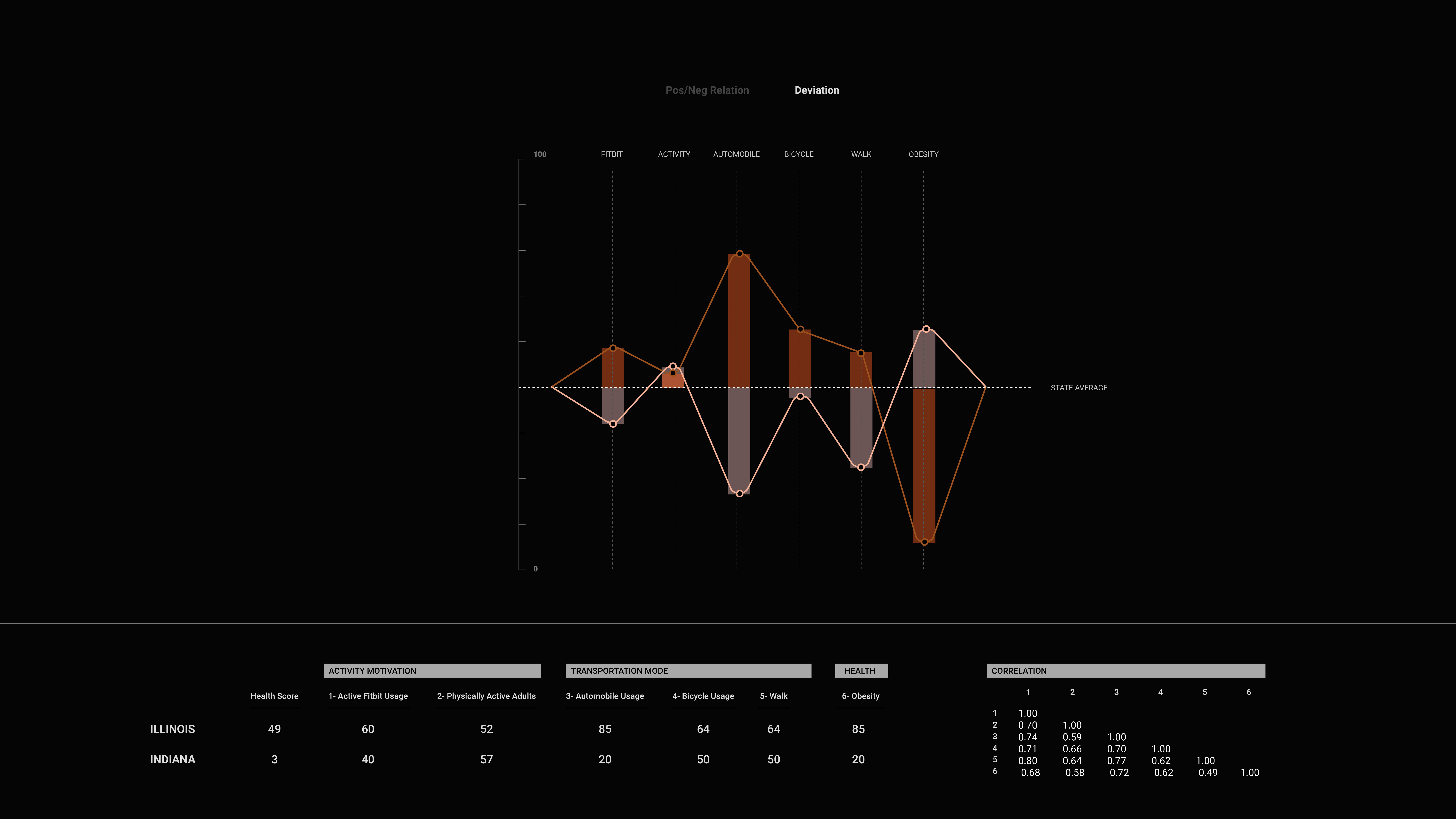
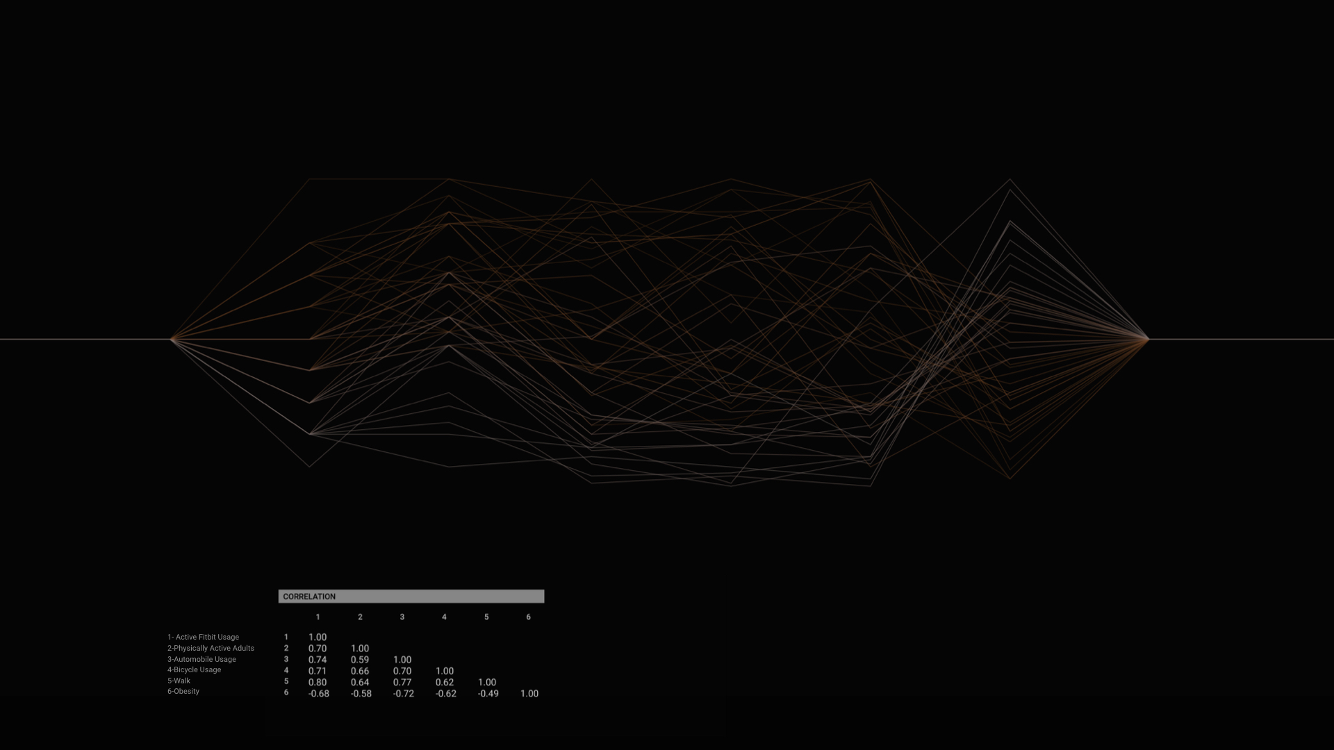
State-based data sets for the following were collected and analyzed: activity tracker usage, active level, transportation modes usage (automobile, public transportation, bicycle, walk), urbanization rate, obesity rate, obesity related mortality rate (heart disease, stroke, diabetes).
Data Normalization & Findings
In order for a discrete comparison, the data was replotted between 0-100 scale, using Min-max scalar normalization method. Analysis results indicated that there were significant correlation between activity trackers and all modes of transportation (p=0.7).Visualization
The visual concept reflects each state’s unique "pulse" based on a health score formula that I defined to represent the overall balance of activity and health : Activity tracker/Active level*Obesity. Each pulse has its own 'Amplitude' and 'Frequency' to convey deviation of each variable from average and health score, respectively. For easier navigation, the states can be filtered based on alphabetical order and health score order.
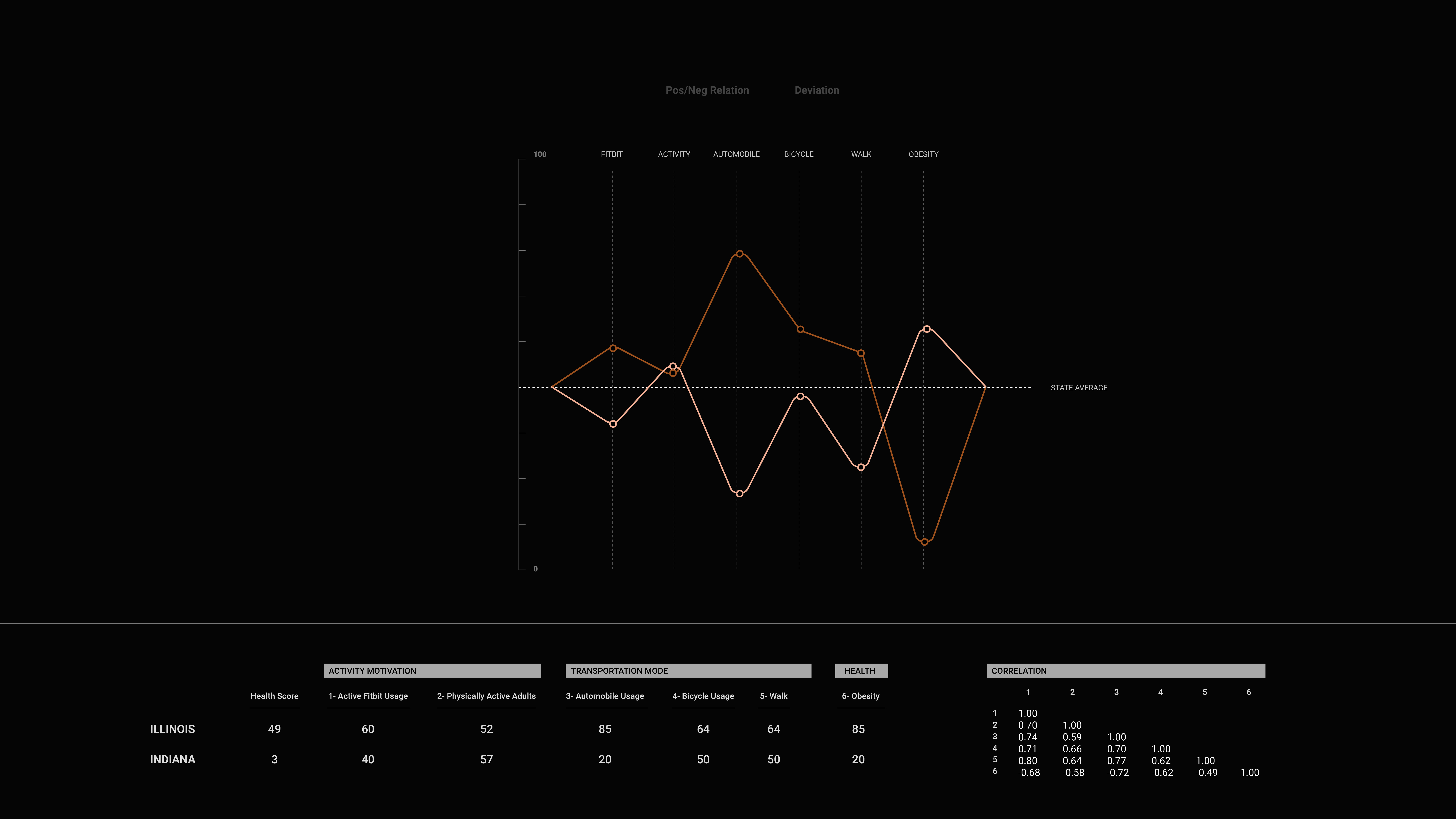
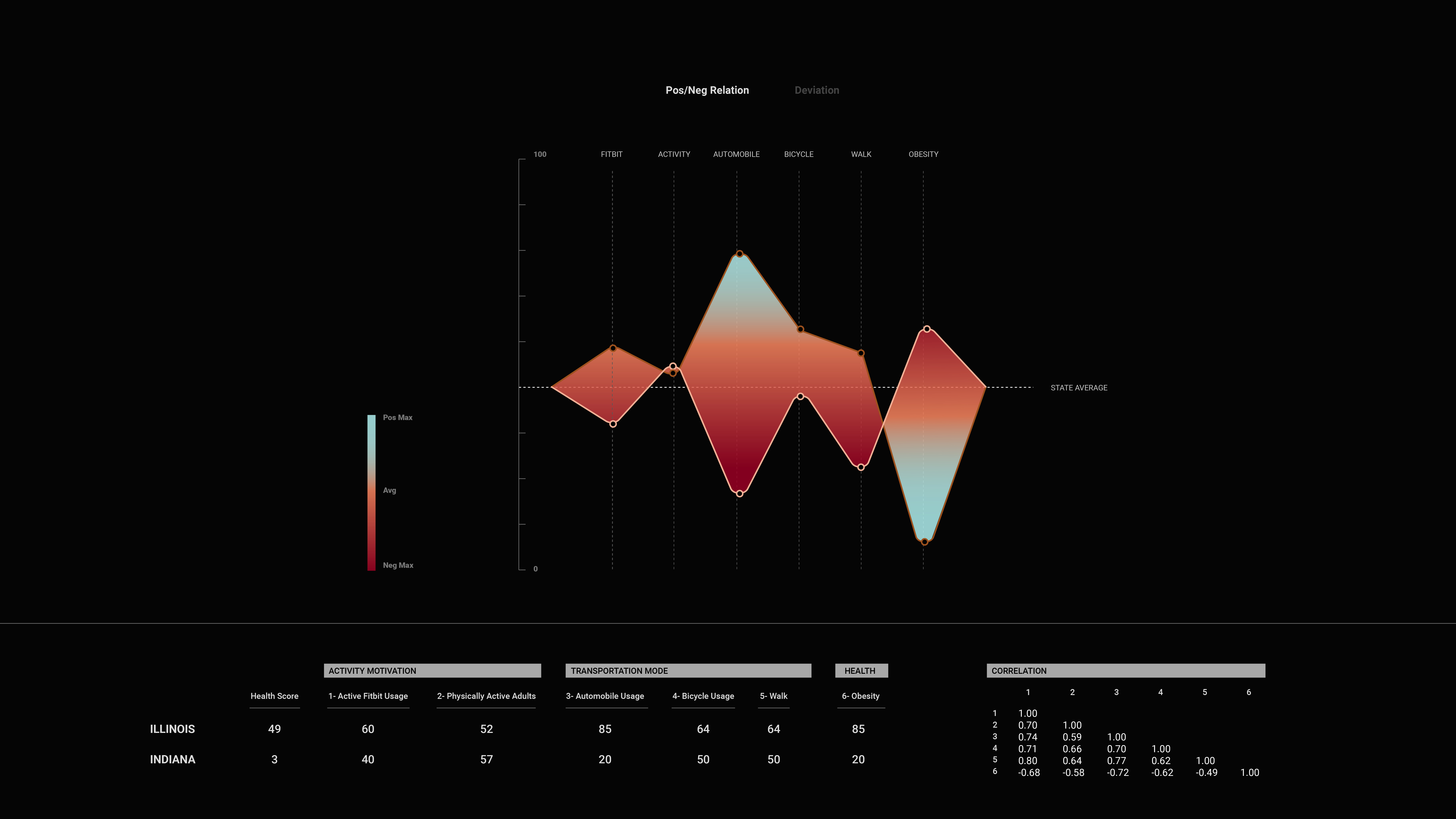
User can select two states to compare the positive/negative relation and deviation.